It seems that many of the cartoons kids watch today are based on Japanese Anime which all seem to have a similar look to them. Often times you see faces locked in an expression with only the lips moving (never in sync with the audio) and many scenes seem to be repeated actions from episode to episode. A time honored recipe dating back to the early '70s.
Battle of the Planets came out on U.S. television in 1978 as a repackaged version of the 1972 Japanese anime program Kagaku ninja tai Gatchaman (which translates into Science Ninja Team Gatchaman). Ninjas in space? Awesome.
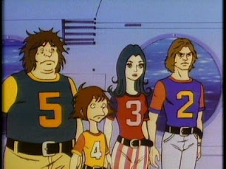
Some of the elements from the original Japanese show were changed or removed for the American audience like profanity, excessive violence and the transgendered leader of the main villain Zoltar.
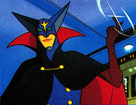 In the American version, the female portion of the script was rewritten as being Zoltar's evil sister (obviously bad parenting at work here). Because of the popularity of Star Wars, the producers also added an R2D2 type robot, 7-Zark-7 and made the show based in space as opposed to the Japanese version which was land based and a bit darker and more violent.
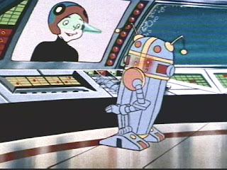
The show itself had some decent stories though many scenes were repeated from episode to episode like the shot of the kids lounging in between missions or their interactions with 7-Zark-7 but overall the show was pretty entertaining. When compared to the Japanese version, the Japanese version has a more consistent story line and theme as opposed to the American version which seems to have some elements forced together to work for the American audience. If you have nothing to compare it to though, you loved it and probably remember trying to run home after school in time to catch another episode of Battle of the Planets - even though you probably saw each episode about 50 times!
Battle of the Planets came out on U.S. television in 1978 as a repackaged version of the 1972 Japanese anime program Kagaku ninja tai Gatchaman (which translates into Science Ninja Team Gatchaman). Ninjas in space? Awesome.
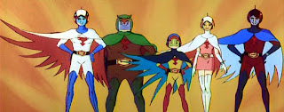
Battle of the Planets was based on the story of five "remarkable" teenagers, Mark, Jason, Tiny, Princess and Keyop, known as G-Force (not to be confused with the hamster movie of the same name) who spent their days trying to protect Earth from the evil planet "Spectra" and other attacks from "beyond space". Their mother ship, The Phoenix, was aptly named for it's ability to transform into a fiery bird (a Phoenix to be precise) and basically become a bird shaped blow torch in space.
Remarkable Teen-Agers wearing numbers

Some of the elements from the original Japanese show were changed or removed for the American audience like profanity, excessive violence and the transgendered leader of the main villain Zoltar.
Zoltar - Looking fierce and Fab-u-lous
 In the American version, the female portion of the script was rewritten as being Zoltar's evil sister (obviously bad parenting at work here). Because of the popularity of Star Wars, the producers also added an R2D2 type robot, 7-Zark-7 and made the show based in space as opposed to the Japanese version which was land based and a bit darker and more violent.
7-Zark-7 at the controls of his DJ booth?

The show itself had some decent stories though many scenes were repeated from episode to episode like the shot of the kids lounging in between missions or their interactions with 7-Zark-7 but overall the show was pretty entertaining. When compared to the Japanese version, the Japanese version has a more consistent story line and theme as opposed to the American version which seems to have some elements forced together to work for the American audience. If you have nothing to compare it to though, you loved it and probably remember trying to run home after school in time to catch another episode of Battle of the Planets - even though you probably saw each episode about 50 times!

Comments